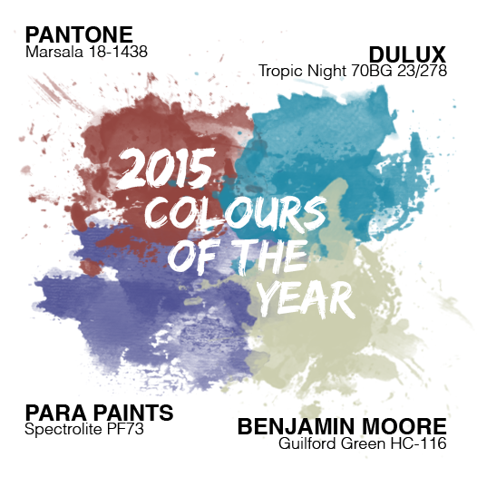
Looking ahead at 2015 colour trends
2015 is a big year for colour, and what better way to start the year off than with the top colour picks of 2015 from brand managers at some of the major paint companies.
In revealing their picks for the top colours for the New Year, there was no surprise that we saw some overlap – they’re all on the same page, and that’s good for us – giving a solid idea of what’s to come, and in a big way.
Pastels, self-expression, harmony, and nuanced naturals – the list goes on – 2015 has been deemed the year of possibility, and we shouldn’t expect anything less.
Pantone, Benjamin Moore, Dulux and Para Paints all have something to say this New Year for 2015 colour trends.
Discover a World of Possibilities.
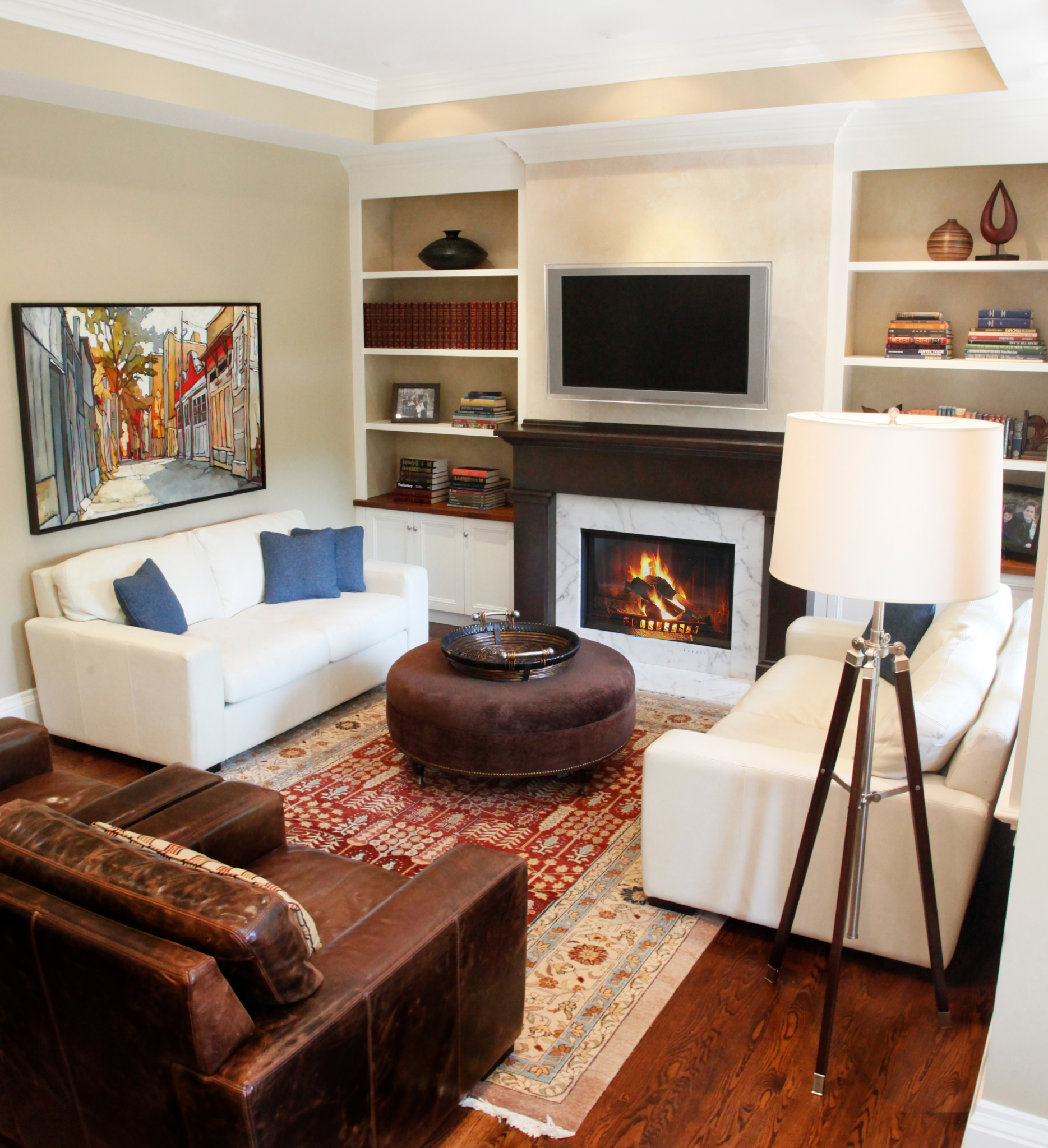
A place of refuge – The home is where we can truly express ourselves. Take a look at some of the 2015 Colour trends from some top brand managers.
Pantone
Marsala – a naturally robust and earthly wine red – enriches our minds, bodies and souls.
Marsala makes for an elegant, grounded statement color when used on its own or as a strong accent to many other colors.
Marsala is a subtly seductive shade, one that draws us in to its embracing warmth. Nurturing and fulfilling, Marsala is a natural fit for the kitchen and dining room – making it ideal for tabletop, small appliances and linens throughout the home. – Leatrice Eiseman – Executive Director, Pantone Color Institute
Click the image below to see Pantone’s 2015 colour trends

Looking for a dash of elegance to your room? No matter the room Marsala can add that touch of chic rich flavour. Perfect for accessories, rugs and upholstered living room furniture, Marsalas plush characteristics are great for textured surfaces and can liven up just about any room.
But why Marsala?
We felt it was time for something that spoke to people’s real needs—the need of nurturing, the need for something more robust that had a life force that was intrinsic to it. The most interesting thing about Marsala, I think, is that even though it has this grounded influence, this earthy undertone we see in the wine-red, at the same time, it has this sophistication. There is something very versatile about the color. – Leatrice Eiseman – Executive Director, Pantone Color Institute
#ColorTrends2015 #Coloroftheyear
- Guilford Green HC-116
A neutral that’s natural. A silvery green that works with, well, everything. No worries. No second thoughts. Just a brush, dipped in a can, whooshed on a wall, and a whole lot of happily ever after. – Ellen O’Neill, Creative Director, Benjamin Moore
Click the image below to see Benjamin Moore’s 2015 colour trends
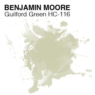 A colour that ties all things together – Guilford Green got the seal of approval from Benjamin Moore for their collection as their 2015 colour. Guilford Green is a silvery green that’s neutral and natural. The company’s colour trends forecast includes 23 hues in greens, blues, blush and berries that are bolder and deeper than the pastels of 2014.
Dulux
Looking for something a little more daring for 2015? – Dulux has just the thing for you. Ruby Ring (red), Stage Fright (plum) and Blazer Blue are among the standouts in the 2015 collection. The Dulux colour of the year is the clear blue shade Tropic Night (70BG 23/278).

Martin Tustin-Fuchs, Brand Manager for Dulux, says they look at everything from fashion to electronics to the world mood when determining which colours will reign supreme.
Click the video below to see Dulux’s 2015 colour trends
The four Connection palettes Wildland, Silentshift, Modhaus and Earthwerks, range from the dark and moody to bright and bold, representing concepts associated with connecting, reconnecting and disconnecting in the real world.
Para turns 100 and names Spectrolite (PF73) Colour of the Year for 2015.
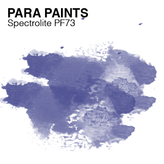
The dark, deep, stellar blue inspired by the awe-inspiring colours of the universe exudes a high level of spirituality, while working wonders with other neutral or sophisticated shades, like greys and blacks. With the growing use of tinted blacks and dark blues, Spectrolite casts a peacefully calm and clear mood. Para thinks 2015 will be a year for showing off some confidence in the home, with Canadians looking to bolder and darker hues to accent their spaces.
PARA’s 2015 Centennial Trend palettes include Indulgence- bold colours of bordeaux and deeps greys, Mystique- invigorating blues with grey undertones, Dawn- earthy neutrals & khaki shades and Impulse-, a collection of unique high impact colours creating a contemporary ‘all or nothing’ approach to designing with colour.
PARA Paints’ complete 2015 Centennial Colour Trend line up will be released and showcased at The Interior Design Show in Toronto in January 2015.