A new year is upon us which means a fresh start to planning upcoming renovation projects. It’s also the time when discussions in our studio involve the forecasted Colours of the Year. It seems that all of the major players are in agreement for 2016 and that neutrals and pastels are leading the way.
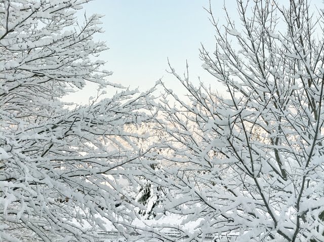
Pantone’s selected choices Rose Quartz and Serenity Blue combine warmth & tranquility.
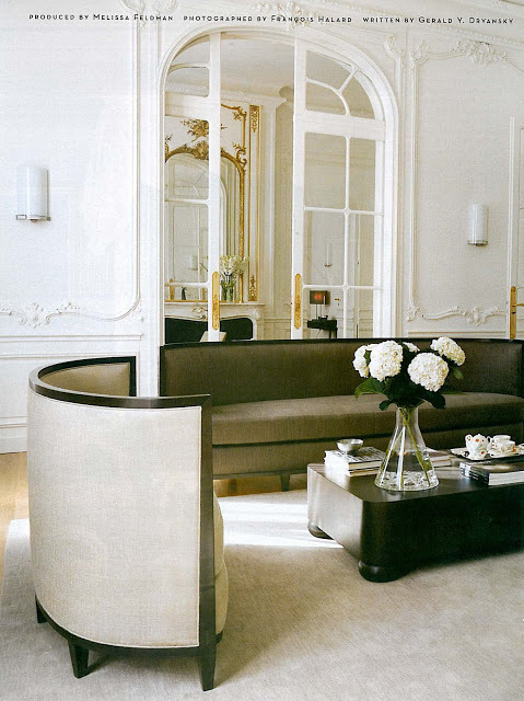
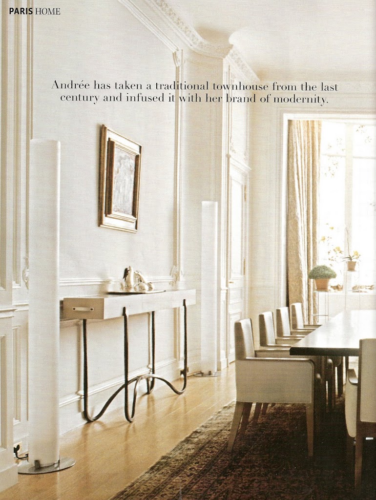
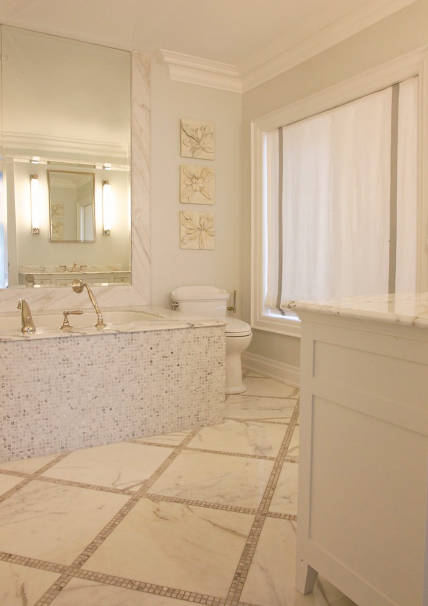
CIL, Dulux, Farrow & Ball, Para Paint and PPG all agree that serene and calming colours such as light blues, blush pinks, soft greens, earthy browns and chalky greys will be especially popular in residential design.
The new pastel colours are more natural and pigment infused than those associated with the 80’s, so don’t discount them yet! This new colour palette emphasizes that the home should be a place of sanctuary from the challenges of modern day life.
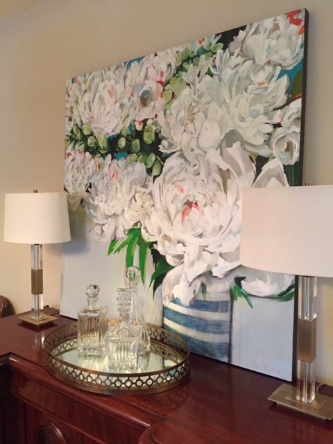
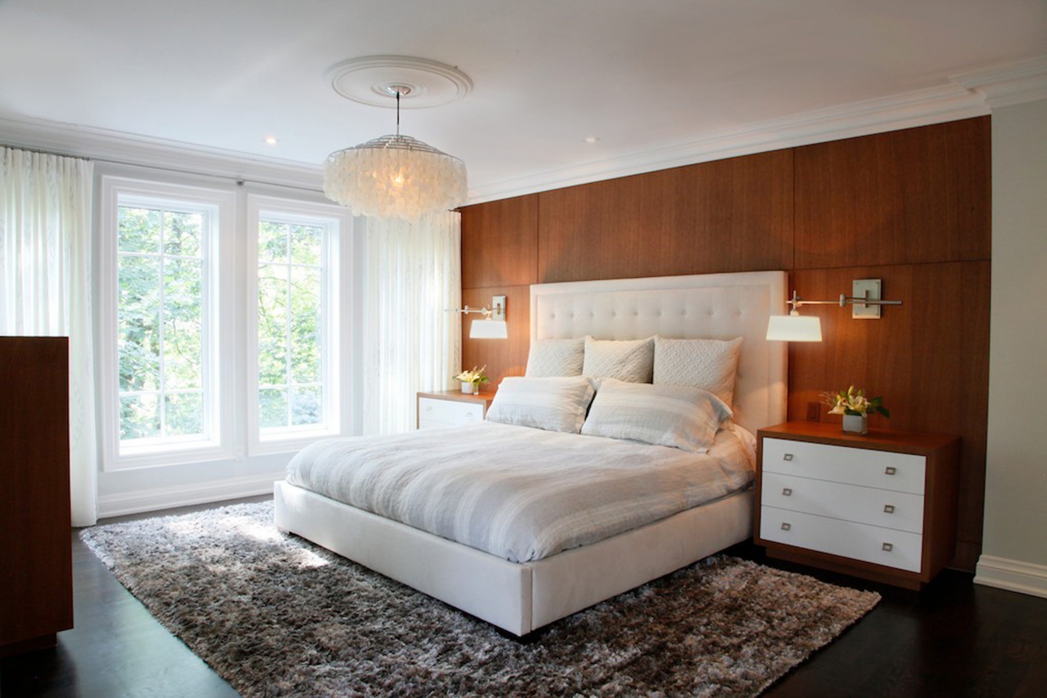
Natural & textural materials are also key ingredients to this theme. It isn’t coincidental that these colours also pair perfectly with warm metallics that enhance these soft hues and are becoming increasingly popular again.