The worlds of Interior Design and Fashion influence one another. This is evident in the common trends moving into Spring and Summer 2015. We have already started implementing some of these trends into projects and we’d like to share some of our favourites:
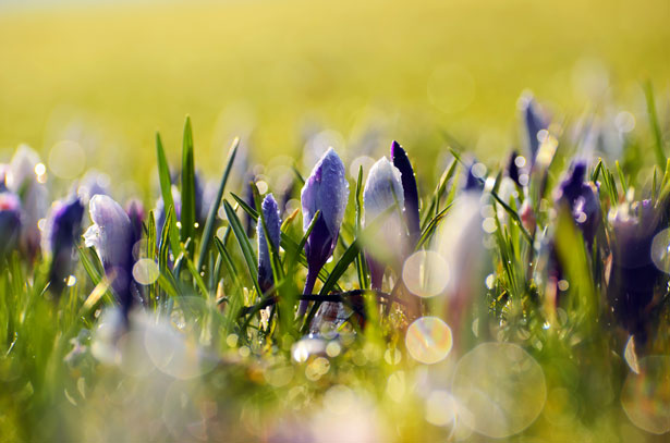
Pastel Colours
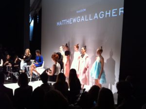
We touched on the emergence of pastel colours in our January Blog. Attending fashion shows for Spring 2015 at Toronto Fashion week and seeing clothing collections featuring soft lavenders, sage greens and blush pinks reinforced this colour palette and provided inspiration. Using one of these colours or in combination can definitely freshen up a space. The overall aesthetic doesn’t necessarily have to be too feminine if paired with striking furniture and accessories in black or dark wood finishes.
These pastel colours also pair beautifully with warm metallics…
Warm Metallics
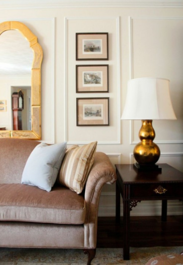
The popularity of metals such as bronze, copper and gold currently seen in the fashion world are also prevalent in interiors. New collections of furniture, light fixtures, hardware and accessories are all featuring these warm metallic finishes.
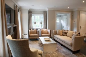
Natural and Authentic Materials
Using materials in their raw or natural state and using neutral tones such as creams, whites and browns can result in serene or relaxed space. Handcrafted wood furniture and neutral earthenware can be combined with interesting textures in surfaces, fabrics and artwork.
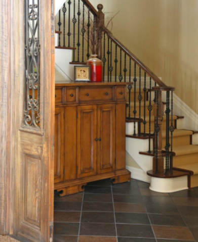
We repurposed a pair of antique doors in their original state and had them installed on either side of the entryway above. They provide an interesting focal point into our client’s lower level recreation room.
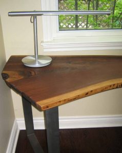
The custom table desk shown above features a black walnut wood top salvaged from a fallen tree and a raw steel base. Our client fell in love with the beautiful wood slab so we enjoyed designing this piece for his home office.
Graphic Patterns & Geometrics
Black & White and Navy & White colour combinations are classics and still going strong and appearing in geometric patterns. Combining patterns in various sizes and scale can result in a bold statement for the adventurous client. Introducing a geometric into one statement piece such as an area rug, piece of art or upholstery fabric can still incorporate the trend in a more subtle way.
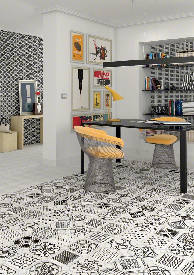
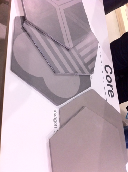
Geometric shapes are gaining popularity in products such as tile. Hexagon shaped tiles have previously been popular in European interiors and are gaining in popularity now in Canada. We saw lots of interesting new tile options emerging at the IDS show like the ones shown above.
Bold Saturated Colours
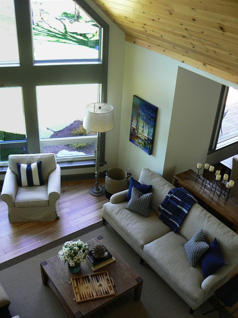
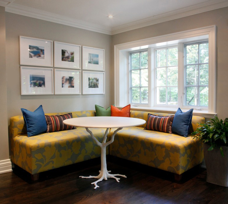
If bold patterns are not your style, creating a bold statement can just as easily be achieved with the use of solids in bold bright colours. Cobalt and midnight blue are popular choices and provide a strong statement when combined with the warmer hues of yellow ochres and rusty oranges.
Cobalt blue was the dominant colour of choice in our client’s country home. It can be found in fabrics & accessories, as well as in dramatic artwork throughout.
The combination of bold colours used in this kitchen eating area provides a cheerful place for a young family to spend time. These fabrics are not only beautiful, but practical – they are sun and stain resistant and will stand the test of time.
Interested in knowing more about the interiors above or other 2015 trends? Let us know in the comments below, or join us on social media.
![]()
![]()
![]()
![]()
![]()
![]()